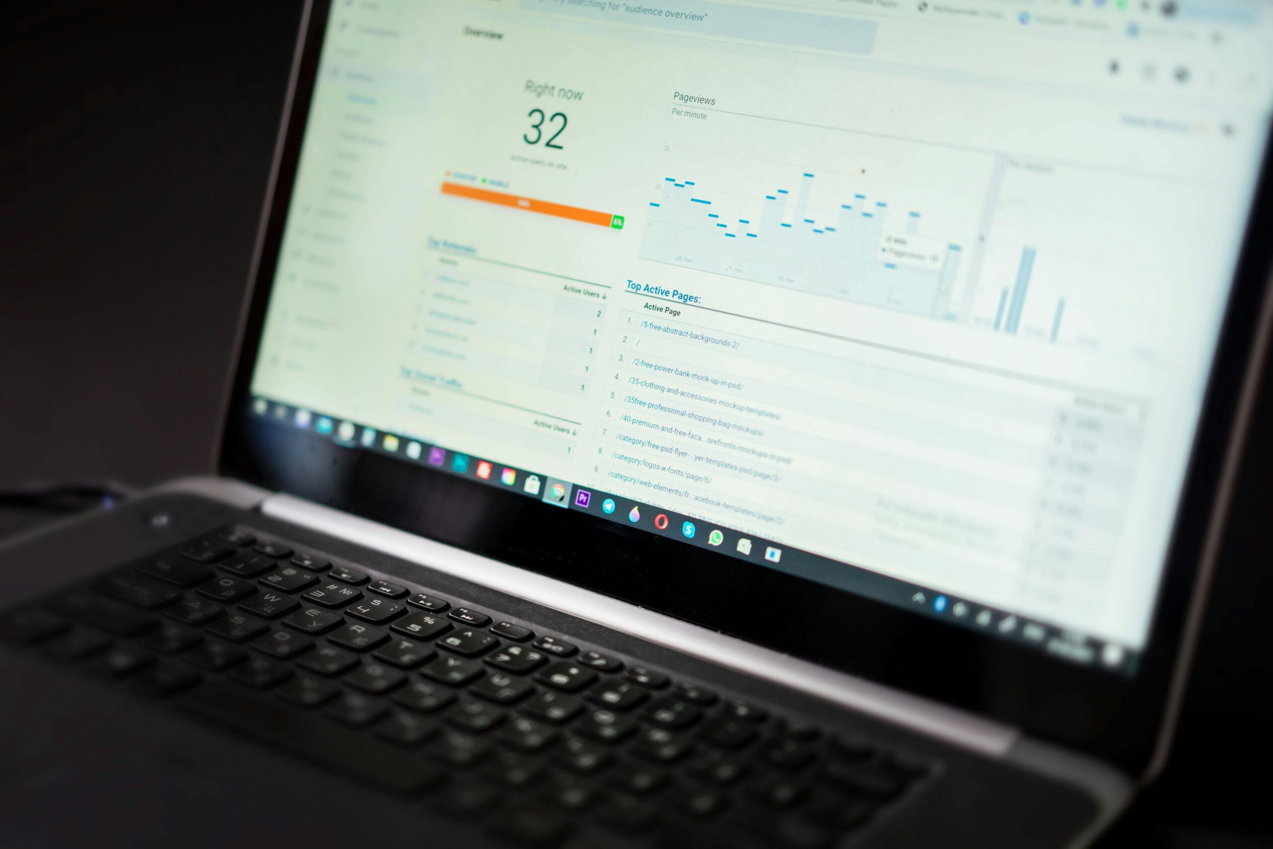
Visual dashboards have revolutionized how we understand and manage our digital habits, transforming raw screen time data into actionable insights that empower better decisions.
📊 The Rising Need for Screen Time Visibility
In an era where smartphones have become extensions of ourselves, understanding how we spend our digital hours has never been more critical. The average person now spends over seven hours daily interacting with screens, yet most remain unaware of their actual usage patterns. Visual dashboards bridge this awareness gap by presenting complex behavioral data in digestible, meaningful formats that reveal the true story behind our digital consumption.
Screen time tracking isn’t about judgment—it’s about awareness. When we can visualize our habits through well-designed dashboards, patterns emerge that would otherwise remain invisible. These insights become the foundation for intentional living in our hyperconnected world, enabling us to reclaim control over our attention and time.
🎯 What Makes a Dashboard Truly Effective
Not all dashboards are created equal. The most powerful visual interfaces share common characteristics that transform data into understanding. Effective screen time dashboards prioritize clarity over complexity, focusing on metrics that genuinely matter rather than overwhelming users with unnecessary statistics.
The best dashboards employ intuitive color schemes that communicate meaning at a glance. Red might indicate excessive usage, yellow suggests moderate patterns, while green represents healthy boundaries. This visual language allows users to assess their digital wellness within seconds of opening the dashboard, eliminating the need for deep analysis every time they check their stats.
Essential Components of Screen Time Dashboards
Successful dashboards incorporate several key elements that work together to provide comprehensive insights. Total daily usage serves as the headline metric, but breaking this down into categories reveals the nuanced story. Application-specific tracking shows which apps consume the most attention, while hourly breakdowns identify peak usage periods throughout the day.
Trend visualization over weeks and months adds temporal context, revealing whether habits are improving or deteriorating. Comparative metrics against personal goals or population averages provide motivational benchmarks that encourage positive change. Notification counts and pickup frequency round out the picture, exposing compulsive checking behaviors that undermine productivity and presence.
🔍 Interpreting Visual Data Patterns
Reading a screen time dashboard effectively requires understanding what different visual patterns indicate about your digital behavior. Spikes in usage often correlate with specific triggers—stress, boredom, or particular times of day. Identifying these correlations empowers you to implement targeted interventions rather than attempting wholesale behavioral changes.
Consistent evening usage spikes might indicate screen dependency before sleep, a pattern known to disrupt circadian rhythms and sleep quality. Morning peaks could reveal phone-checking as a first daily habit, potentially setting a reactive rather than proactive tone for the day. Weekend patterns frequently differ dramatically from weekdays, suggesting context-dependent usage worth examining more closely.
Recognizing Unhealthy Patterns
Certain dashboard patterns serve as red flags warranting immediate attention. Gradual upward trends in total screen time indicate habit creep, where usage slowly increases without conscious awareness. Disproportionate time in social media or gaming applications compared to productive or creative apps suggests potential imbalance in digital diet.
Fragmented usage patterns with hundreds of daily pickups indicate compulsive checking rather than intentional usage. This scattered attention pattern correlates with decreased focus, higher stress levels, and reduced ability to engage in deep work. Dashboard visualization makes these concerning patterns impossible to ignore, creating the cognitive dissonance necessary for behavioral change.
📱 Leveraging Built-In Platform Analytics
Both iOS and Android now include native screen time tracking features that provide robust dashboard capabilities without requiring third-party applications. Apple’s Screen Time and Android’s Digital Wellbeing offer comprehensive views of device usage, complete with weekly reports, app limits, and downtime scheduling.
These built-in solutions integrate seamlessly with operating system functions, enabling enforcement mechanisms like app blocking and notification management directly from the dashboard. The data accuracy tends to be superior since the tracking operates at the system level rather than relying on accessibility permissions or overlay services.
Customizing Native Dashboards for Maximum Impact
Platform-provided dashboards offer customization options that many users overlook. Setting up app categories helps group similar applications, providing clearer insights into time spent on social media versus productivity tools versus entertainment. Configuring weekly notifications ensures regular check-ins with your data, maintaining awareness without requiring proactive dashboard checking.
Establishing daily limits tied to specific applications transforms the dashboard from passive monitoring to active intervention tool. When limits are reached, the interface changes, creating friction that interrupts autopilot usage. These visual cues at the dashboard level reinforce boundaries and make exceeding limits a conscious choice rather than an accidental slide.
🚀 Advanced Third-Party Dashboard Solutions
While native solutions provide solid foundations, specialized third-party applications offer enhanced visualization capabilities, more granular data analysis, and innovative features that deepen insights. These tools often present data through alternative visual metaphors—forests that grow with time away from screens, or bubbles representing different apps competing for your attention.
Advanced dashboards incorporate comparative analytics, showing how your usage compares not just to your own goals but to aggregated anonymized data from similar demographic groups. This social context can be motivating, revealing whether your patterns align with or diverge from broader trends. Some platforms gamify the experience with achievements and streaks for meeting wellness targets.
Cross-Device Dashboard Integration
Modern digital life spans multiple devices—smartphones, tablets, computers, smartwatches, and smart TVs. Comprehensive screen time understanding requires aggregating data across this ecosystem. Advanced dashboard solutions sync across platforms, providing unified views that capture total digital engagement rather than fragmented device-specific snapshots.
This holistic perspective often reveals surprising truths. Users who successfully limit phone time might unconsciously compensate with increased computer or tablet usage, maintaining overall screen exposure. Without integrated dashboards, these compensatory behaviors remain invisible, undermining wellness efforts through platform substitution.
📈 Turning Dashboard Insights Into Action
Data without action remains merely interesting rather than transformative. The true power of screen time dashboards emerges when insights catalyze behavioral experiments and intentional habit redesign. Effective utilization involves establishing a regular review cadence—weekly assessments that examine trends, celebrate progress, and identify areas requiring attention.
Begin by identifying your most problematic pattern revealed by dashboard data. Perhaps evening usage consistently exceeds intentions, or specific applications consume disproportionate attention. Select one targeted intervention—charging devices outside the bedroom, implementing app timers, or scheduling specific usage windows—and monitor dashboard changes over subsequent weeks.
Setting Baseline Metrics and Meaningful Goals
Before implementing changes, establish clear baseline metrics from your dashboard. Document current averages for total daily screen time, top three applications by usage, pickup frequency, and hour-of-day patterns. These baselines provide reference points for measuring progress and recognizing genuine improvement versus temporary fluctuations.
Goal-setting benefits from specificity and realism. Rather than vague aspirations like “use phone less,” dashboard-informed goals might specify “reduce total daily screen time from 5.5 hours to 4 hours within six weeks” or “limit social media to 45 minutes daily.” Specific metrics enable objective assessment—dashboards clearly show whether you’re achieving targets or need strategy adjustments.
🎨 Designing Your Ideal Dashboard Experience
Personalization transforms generic tracking tools into powerful personal accountability systems. Most dashboard applications allow customization of displayed metrics, widget configurations, and notification schedules. Tailoring these elements to your specific concerns and motivation style maximizes effectiveness and long-term engagement with the tool.
Visual learners benefit from graph-heavy dashboards emphasizing charts and color-coded trends. Detail-oriented individuals might prefer comprehensive tables with precise minute-by-minute breakdowns. Minimalists often respond better to simple, high-level summaries focusing solely on total time and top three applications. Experiment with different configurations to discover what presentation style motivates your awareness and action.
Widget Strategy for Persistent Awareness
Home screen widgets bring dashboard insights directly into daily device interactions, eliminating friction between data and awareness. Strategic widget placement—on the primary home screen where it’s impossible to ignore—creates regular confrontation with usage reality. This persistent visibility prevents the out-of-sight, out-of-mind problem that undermines many tracking efforts.
Configure widgets to display the metrics most relevant to your goals. If reducing evening screen time is your focus, a widget showing today’s usage after 6 PM provides targeted feedback. If compulsive checking concerns you, a pickup counter might be most impactful. The key is making your priority metric unavoidably visible throughout daily device use.
🧠 The Psychology Behind Visual Dashboard Impact
Dashboard effectiveness stems from psychological principles that govern human behavior change. Immediate feedback loops—seeing usage climb in real-time—create consciousness during the behavior itself rather than retrospective awareness. This temporal proximity between action and consequence enables intervention at the moment of choice rather than after the fact.
Visual representation also leverages our brain’s preference for pattern recognition over numerical processing. We instinctively grasp the meaning of upward trending lines or predominantly red color-coded days faster than we process equivalent numerical data. This intuitive comprehension reduces cognitive load, making regular engagement with tracking data effortless rather than burdensome.
Motivation Through Progress Visualization
Well-designed dashboards celebrate progress as visibly as they highlight problems, maintaining motivation through behavior change challenges. Week-over-week comparisons showing declining averages, achievement badges for meeting goals, and positive trend lines all provide psychological reinforcement that sustains effort when habits resist change.
This balanced feedback prevents the discouragement that sabotages many self-improvement efforts. Rather than focusing exclusively on gaps between current behavior and ideals, effective dashboards acknowledge movement in the right direction, however incremental. This positive reinforcement approach aligns with psychological research on sustainable habit formation.
🔄 Adapting Dashboards as Habits Evolve
Screen time relationships aren’t static—they evolve through life stages, work demands, and personal priorities. Dashboard configurations should adapt accordingly, shifting focus from initial problem areas to emerging challenges or new optimization opportunities. Regular quarterly reviews of dashboard setup ensure the tool remains relevant and valuable rather than becoming stale routine.
After successfully reducing total screen time, you might shift dashboard emphasis toward quality metrics—percentage of time in productive versus passive consumption applications. As basic boundaries solidify, attention might turn to temporal patterns, using dashboards to eliminate usage during designated device-free hours or optimizing when different application types are accessed.
💡 Beyond Individual Use: Family Dashboard Applications
Screen time dashboards extend beyond personal use into family digital wellness management. Parental control applications incorporate dashboard views showing children’s device usage, enabling informed conversations about healthy technology relationships. These family dashboards work best when approached collaboratively rather than punitively, using data as conversation starters rather than evidence for restriction.
Family dashboard features typically include cross-device monitoring for each household member, comparative views showing relative usage patterns, and coordinated management tools for implementing household-wide device-free periods. The most sophisticated solutions balance parental oversight with age-appropriate autonomy, gradually transitioning monitoring responsibility to children as they develop self-regulation capabilities.
🎯 Measuring What Matters: Quality Over Quantity
Total screen time, while useful, provides incomplete insight into digital wellness. Two individuals with identical daily totals might have vastly different experiences—one engaging in creative work, learning, and meaningful connection, the other in passive consumption and compulsive scrolling. Advanced dashboards increasingly incorporate quality dimensions alongside quantity metrics.
Application categorization enables distinguishing productive from entertainment usage. Some dashboards incorporate user-defined ratings, prompting periodic assessment of whether recent sessions felt worthwhile or regrettable. This qualitative layer adds nuance to purely quantitative data, acknowledging that not all screen time carries equal impact on wellbeing, productivity, or life satisfaction.

🌟 The Future of Screen Time Dashboard Innovation
Dashboard technology continues evolving, incorporating artificial intelligence to identify patterns and suggest personalized interventions. Predictive analytics might flag high-risk periods before they occur, prompting preventive measures. Integration with broader wellness data—sleep quality, physical activity, mood tracking—could reveal correlations between screen habits and holistic health outcomes.
Emerging dashboard concepts explore attention quality metrics beyond simple duration tracking. Eye-tracking technology might assess genuine engagement versus passive presence. Interaction patterns could distinguish focused reading from rapid scrolling. These innovations promise deeper insights into not just how long we use devices, but how we use them and with what level of intentionality and presence.
The journey toward healthier digital habits begins with visibility. Visual dashboards transform abstract concerns about screen time into concrete data, patterns into insights, and awareness into action. By mastering these tools—customizing configurations, interpreting trends, and translating observations into behavioral experiments—we reclaim agency over our attention and time in an increasingly digital world. The dashboard doesn’t solve screen time challenges itself, but it illuminates the path forward with unprecedented clarity. 📊✨
Toni Santos is a digital behavior researcher and cognitive technology consultant specializing in the study of app-use patterns, attention reclamation strategies, and the behavioral frameworks embedded in modern screen habits. Through an interdisciplinary and human-focused lens, Toni investigates how individuals have encoded distraction, dependency, and disconnection into their digital routines — across devices, platforms, and notification streams. His work is grounded in a fascination with apps not only as tools, but as carriers of hidden behavioral triggers. From unconscious usage patterns to attention traps and cognitive overload signals, Toni uncovers the behavioral and cognitive tools through which people preserve their relationship with the digital overwhelm. With a background in digital wellness and behavioral auditing, Toni blends pattern analysis with usage research to reveal how apps are used to shape identity, fragment attention, and encode habitual engagement. As the creative mind behind zorvanys, Toni curates behavioral audits, screen-time studies, and cognitive interpretations that revive the deep personal ties between focus, intentionality, and reclaimed time. His work is a tribute to: The lost clarity wisdom of App-use Auditing and Tracking The guarded rituals of Cognitive Decluttering and Mental Spaciousness The mythopoetic presence of Digital Minimalism Coaching The layered behavioral language of Screen-time Patterning and Insights Whether you're a digital wellness seeker, behavioral researcher, or curious gatherer of forgotten focus wisdom, Toni invites you to explore the hidden roots of intentional technology — one app, one pattern, one screen-free moment at a time.


